Culture
This site visualizes the terrifying levels of U.S. wealth inequality in the simplest way
With a simple scrolling design, this to-scale model shows that Jeff Bezos is only the beginning of a much larger problem.

The gap between the ultra-wealthy and the rest of us is enormous. We know this. Jeff Bezos makes hundreds of millions of dollars every day. We know this. The 400 richest Americans own almost $3 trillion — more than the bottom 60 percent of Americans combined. We know this, too.
But these are just numbers and words. It’s not just difficult to imagine what a trillion dollars looks like; it’s basically impossible. Most people underestimate the wealth inequality problem we’re facing today for this very reason. That’s why GitHub user Matt Korostoff created a simple but poignant website called “Wealth shown to scale.”
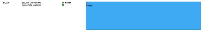
The site sets its scale at $1,000 per pixel and allows users to scroll through the country’s wealth one browser screen at a time. The results are staggering: it’s much easier to conceptualize the country’s wealth inequality when you have to swipe through billions and billions of pixels. The concept doesn’t use any fancy coding tricks, really, instead focusing on letting the visualization speak for itself. Taking a few minutes to scroll through is enough to allow anyone better understand just how horrific this problem has become.

Let’s start with our friend Jeff — One of the main targets of wealth inequality discourse in the recent past is Amazon founder and CEO Jeff Bezos. And for good reason: the man is raking in billions of dollars every month while the vast majority of the United States slumps into a pandemic-related recession. With an 11 percent stake in Amazon, Bezos’ wealth has reportedly risen to a ludicrous $139 billion in the last few months.
Yes, that number sounds wild in theory, but seeing it represented to scale is something else entirely. Rather than shrinking down Bezos’ wealth to a size that could fit on one screen, Korostoff forces you to scroll over and over and over and over and over again to really experience the extent of Bezos’ wealth.

The site also puts this wealth into perspective by sprinkling throughout other to-scale comparisons. The amount of money the average American will make until the day they die — about $1.7 million — fills just a small blue square.

The annual pay for an Amazon warehouse worker? You can barely even it see it amidst the vast sea of Bezos’ wealth. Even Beyoncé’s wealth takes up barely one screen’s worth of space; scroll too quickly and you’ll miss it.

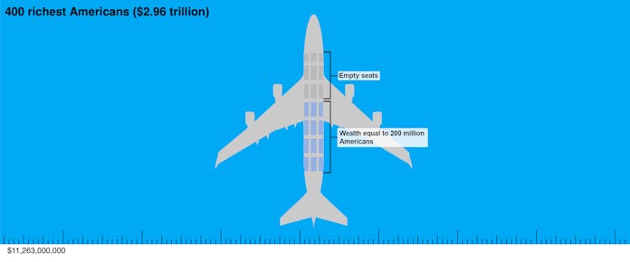
And then there’s the rest of the wealth — Korostoff’s site goes beyond Bezos to present for visitors the real problem here: Bezos is just the beginning of a problem that’s much, much larger. The 400 top earners in the country own approximately $2.96 trillion. As Korostoff says, that’s a number so abstract to most people you “might as well say ‘eleventy gajillion zillion dollars.’” The people who own this wealth could all sit comfortably on a single 747 plane with 260 seats leftover.
In order to put this amount of money into perspective, the site presents a few ways portions of this wealth could be used. In total, we could take 85 percent of the wealth of these 400 individuals and do the following: test every American for COVID-19, eradicate malaria worldwide, provide clean water and waste removal for every human on Earth, eliminate federal taxes for households making under $80,000 per year, give $10,000 to every American household — and still leave enough for every one of those 400 people to still be a billionaire afterward.

At this point in the site you’ve been scrolling for what feels like forever. But you’ve barely made a dent in the sea of blue. Even at top speed, you’ll have to keep scrolling for a few minutes straight to make it through to the end of all that wealth.
Picturing the United States’ wealth inequality in this way is smart because it forces us to reckon with the problem in an unusual way. You can’t just read the numbers and move on like you normally would. You have to scroll for ages to get to the bottom of the cash. And, on the way, you can visualize just how far all that wealth could go towards better causes.
