Design
Marc Newson's trippy, aborted Apple retail concept is '90s color overdrive
The legendary designer had some iMac G3-esque ideas that would have made the Apple Store a very, very different experience.
“Here’s what things used to look like” is always fun to indulge in, especially when Apple is involved. An old video of an even older retail concept by Marc Newson is making the rounds thanks to the r/ObscureMedia subreddit. The clip, which was animated by Me Company, reveals what would have been an extremely ‘90s shopping experience.
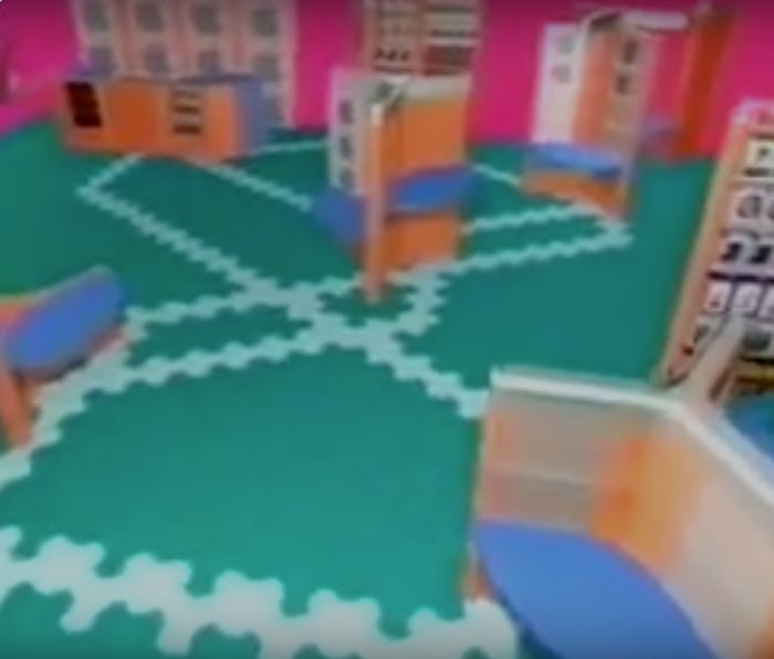
Color, color, color — Translucent plastics reminiscent of the iMac G3 feature throughout the colorful displays, from blue-and-orange trigon tables and shelves to wall panels with massive Apple logos. Even the green floors were imagined in the same material applied to interlocking trigon panels. It's not surprising to see the bold color hits, considering Newson at this point was an ascendant, celebrity industrial designer. His new spins on everything from Ford cars to Pentax cameras are the stuff of legend in the world of ID.
But really, it’s the vivid, retro animation that makes the experience. As if the concept itself wasn’t enough, the background is bright pink. It builds up each of the components while breaking down the features of a hilariously jubilant soundtrack. Eventually, you see the entire store in all its rich splendor — a far cry from the sleek, modern stores we’re all used to.
Watch the video below and indulge in some nostalgia for what never was.
