Chaotic Good
Comic Helvetic is an unholy combination of two iconic fonts
No one asked for this mix of Comic Sans and Helvetica, but I can't deny, it's pretty compelling.
I associate Helvetica with a certain sense of order — refinement, that with overuse, becomes lazy shorthand for being thoughtful. It’s a tasteful business suit, but it’s still a business suit. Comic Sans, on the other hand, just makes me think of clowns.
Comic Helvetic, an experimental font from designer Alexander Pravdin, is the “wearing a business suit with clown shoes” of fonts (via kottke.org).
In other words, it’s perfect.
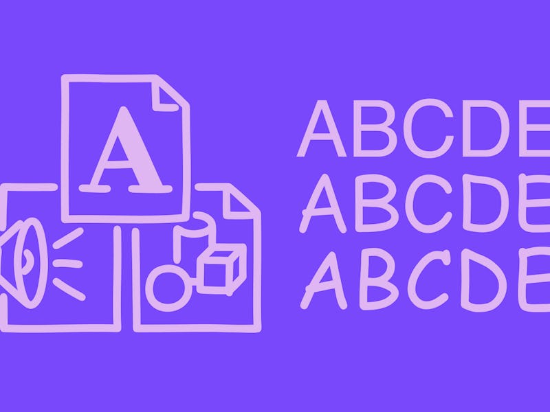
Unholy union — Comic Helvetic carries some elements of the goofier, child-friendly Comic Sans, like the rounded ends on each character (one of the parts that’s supposed to evoke the hand-inked letters of a comic strip) and the simple, and highly legible lines and shapes of Helvetica.
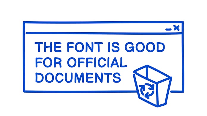
Both fonts are sans-serif (without the little “tails” you might find on Times New Roman) so combining them actually works far better than my initial knee-jerk reaction prepared me for. Comic Helvetic is easy to read and a little bit playful. Great for school or the office.
Other designers have tried to elevate Comic Sans in the past — Comic Neue lightens and straightens out the classic font to produce something that’s far more presentable — but Comic Helvetic has a certain chocolate and peanut butter energy that’s hard to deny. Two great tastes (fonts) that taste great together.
There’s no soul-searching quest necessary. Comic Helvetic is undeniably good.
You can download Comic Helvetic for free and see for yourself.
